ACE OF SPACE
Ace of Space

A few of my biggest interests in life are space and physics, therefore I often browse websites and try to look for information can create something out of in combination with my creative skills.
For this project I was scrolling through NASA’s Solar System Exploration website which I had never seen before, and was absolutely amazed by the beautiful UI they had designer for this page. It was informative, fun and aesthetically pleasing at the same time. I was so inspired by this that I decided to do a design sprint.
I gave myself 24 hours to create something that was inspired by their website and quickly came up with the idea of a deck of cards. Very often I find myself looking for and wanting space themed objects, just for the fun of it. A lot of them look the same (dark blue or black with starry patterns) and are packed with information. While I agree that these components make for great space themes, I don’t always love how it looks.
Also, sometimes I just want to have something nice to look at that is connected to my interest without it carrying an essay of information. Perhaps just something small, something playful, easy to understand, something that looked more like all the incredible retro posters from the 60’s, 70’s and 80’s that I have saved in my Pinterest boards.
The first name that came to my mind was the Motörhead song “Ace Of Spades” from 1980. I was thinking about how much Spades sound like Space, and how Ace of Spades traditionally is known as the highest and most valued card in the deck. It got me pondering about how we are living in a true “Ace of Spades”-time, where we have the technology allowing us to make the discoveries we are making right now.
My idea was born, and my process had commenced. I initiated with:
Stage one: Get inspired and get sketching

Img courtesy of NASA
First of all I wanted to decide on how many cards I wanted to do, and what I wanted them to contain. Since I had given myself a limited amount of time I settled on not doing a full deck, but focusing on the cards I knew I would love.
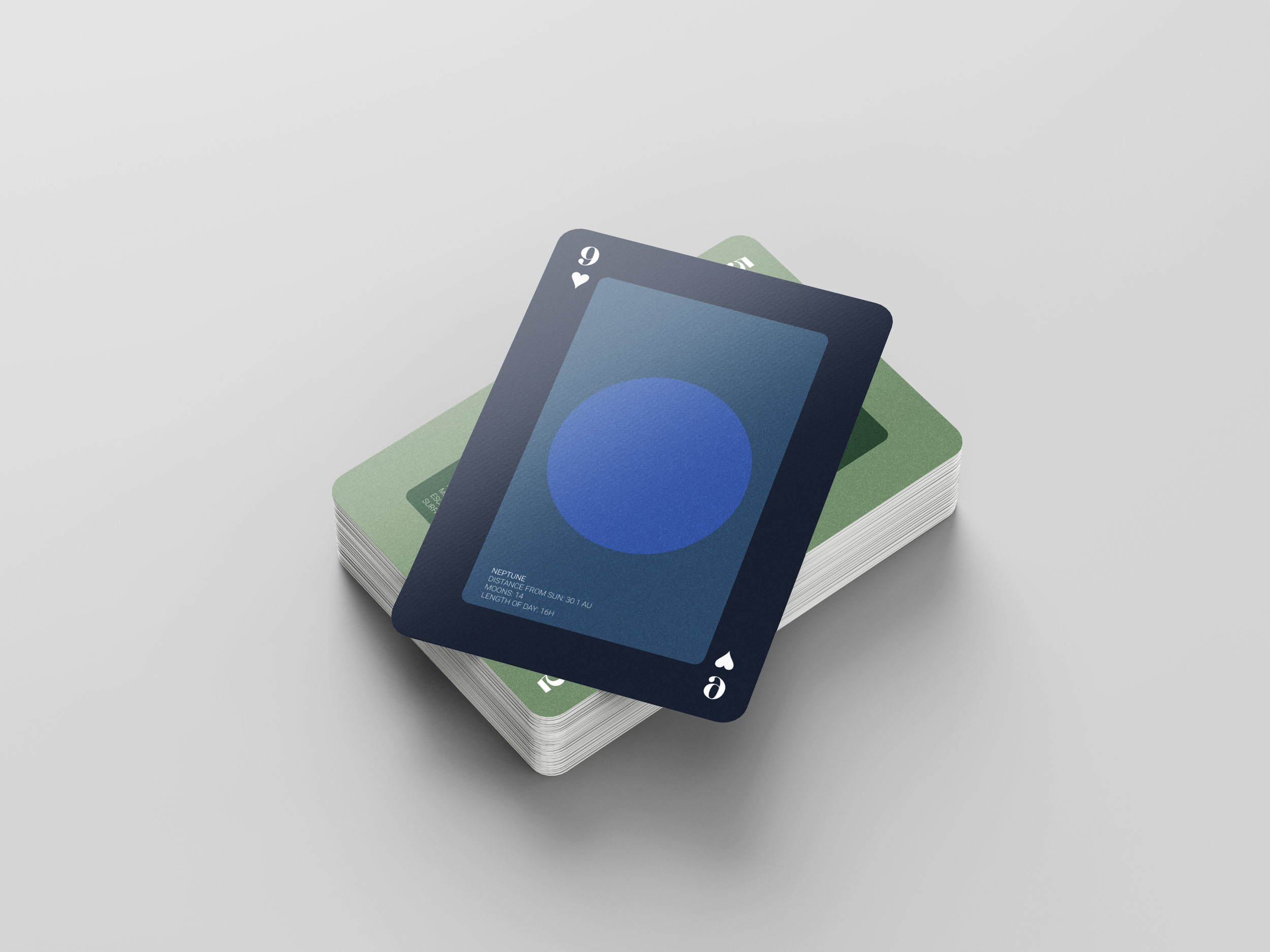
For example, I knew that Neptune would shine amazingly with that vibrant blue color and that Uranus would look beautiful with its close to 100 degree equatorial inclination and faded ring.
I started with taking the inspiration I had and creating a wireframe for how I wanted the card to look like. After this I moved on to:
Stage two: Identify and pursue
After deciding on what I wanted the card to look like, (clean, one celestial body in the middle surrounded by a thin frame, suit underneath value) and deciding what I didn’t want it to look like, (too detailed patterns, suits representing value by showcasing themselves) I could move on and start designing.
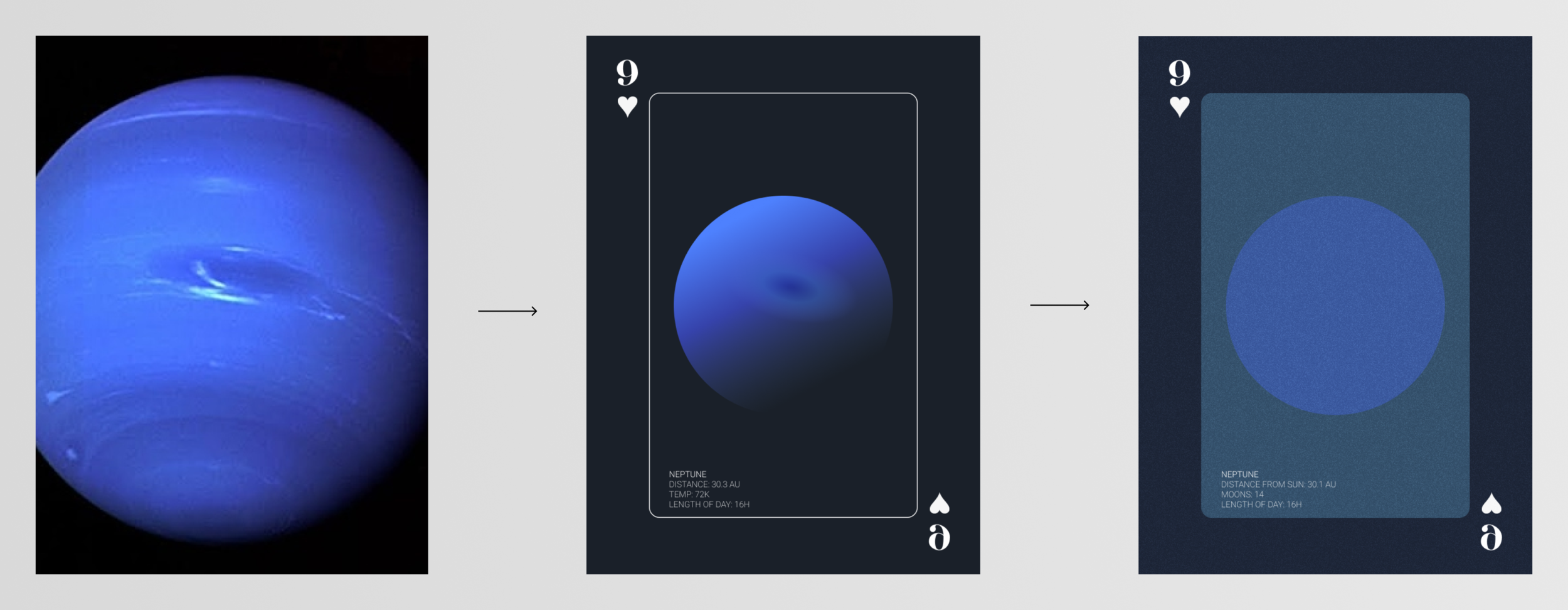
I started out rendering the image I had as a source in a very minimalistic way. I actually loved this first sketch, but found it a bit too alike the typical space theme I was trying to get away from. In this stage I also added some of the facts that I found from the NASA page that initially inspired me to do this whole project.
This gave me the idea of creating three steps for my process. The first one would be to find a photo, the second would be to create this simple, gradient, “if you squint it kind of looks the same as the photo”-design. These cards would in turn be the catalysts for the fun, playful and colorful versions of the final designs in the last step. By doing my cards this way, I could see a clear journey from actual photo to where I wanted to land.
This led me to:
Stage Three: Define and perfect

Now I had my first sketch. All I had to do was to mentally copy and paste this concept into the rest of the celestial bodies I wanted to put on the cards, find the right facts for each item and carry out the process. With each object, I asked myself different questions such as;
What is the most significant recogniser?
How do I design that without adding too much detail?
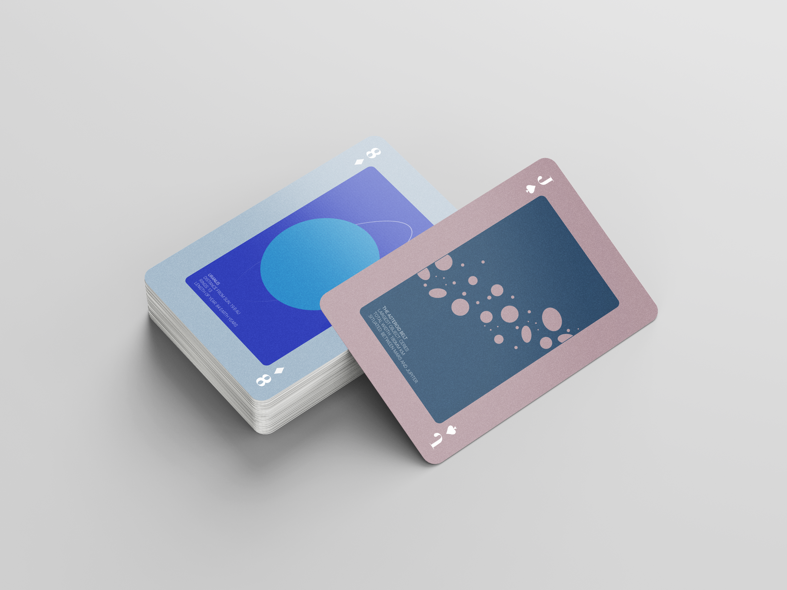
Which order should they go in? Since I knew wanted to include the moon and the asteroid belt, should they come in between the planets as they do in real life or should I save them for higher values?
My imagination was running free with all the incredible things the planets were capable of. For example, the enormous mass of Jupiter interacting with its innermost largest moon, Io, creates huge tidal bulges on both moon and planet. How can I depict this in a simple way?
These questions led me to the result of these eight cards.
After this I was at my last phase:
Stage Four: Finalise and integrate

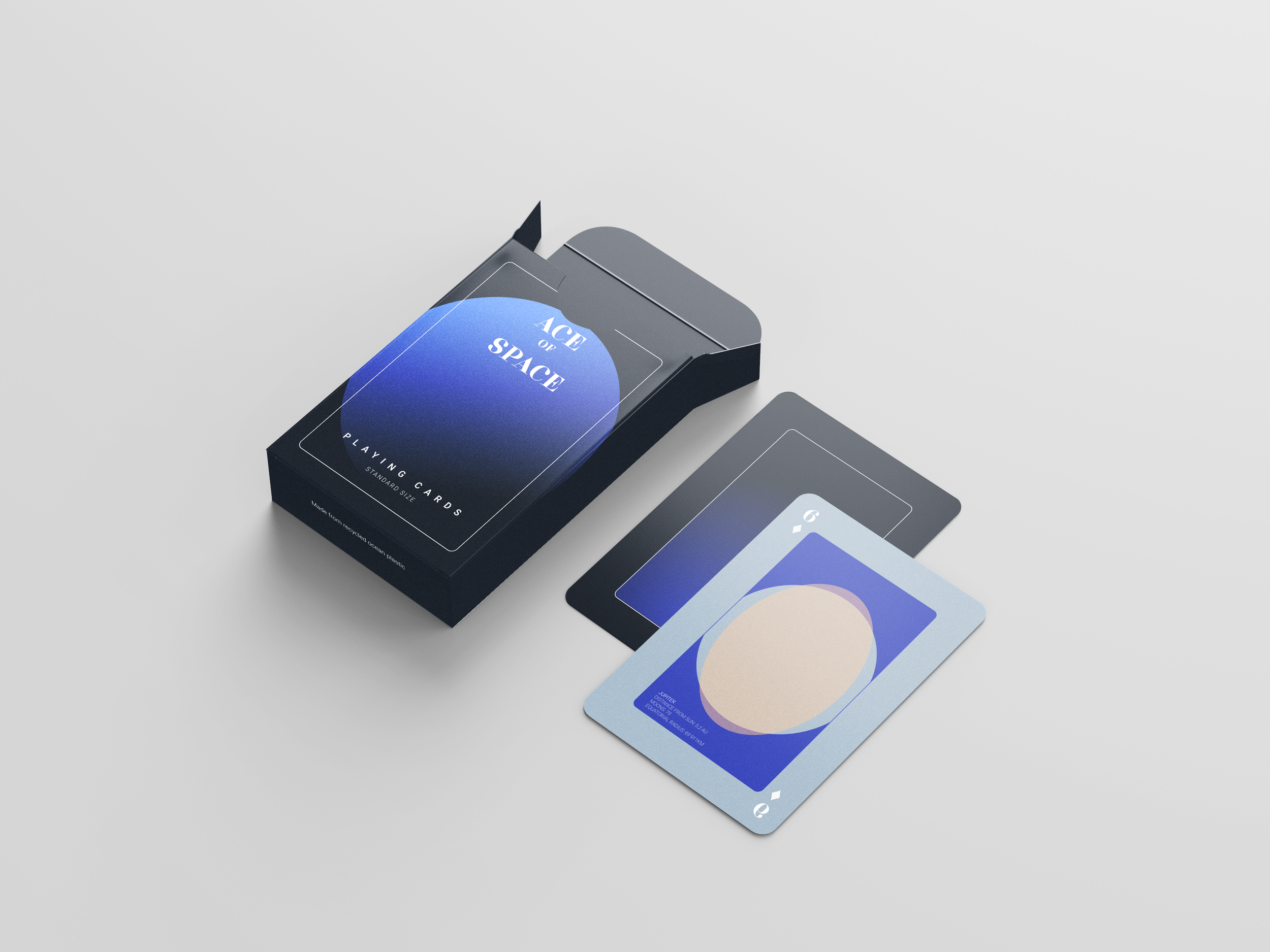
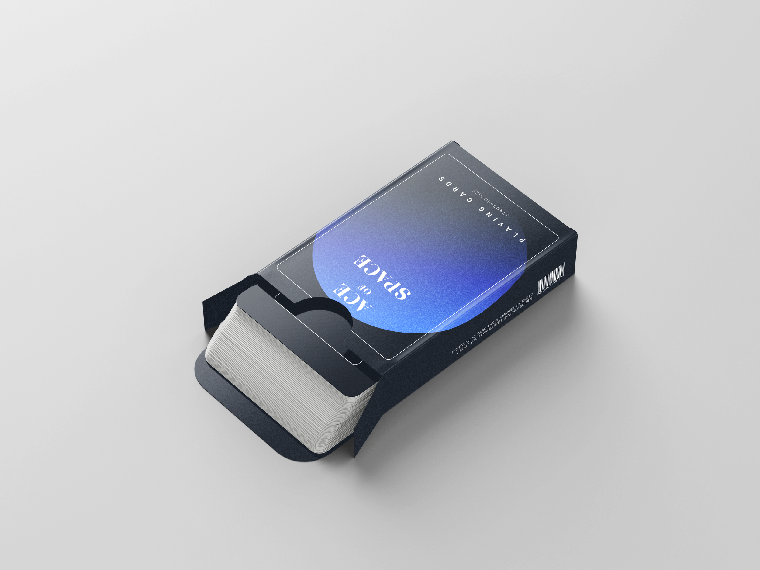
By this point I was running low on time and I wanted to respect the time-frame I had given myself. I spent the last hours I had left on creating a cover, a backside for each card and mockups for my designs. By now I had decided on which color each suit should have, since I didn’t want the traditional red and black ones, and all the facts were in place.
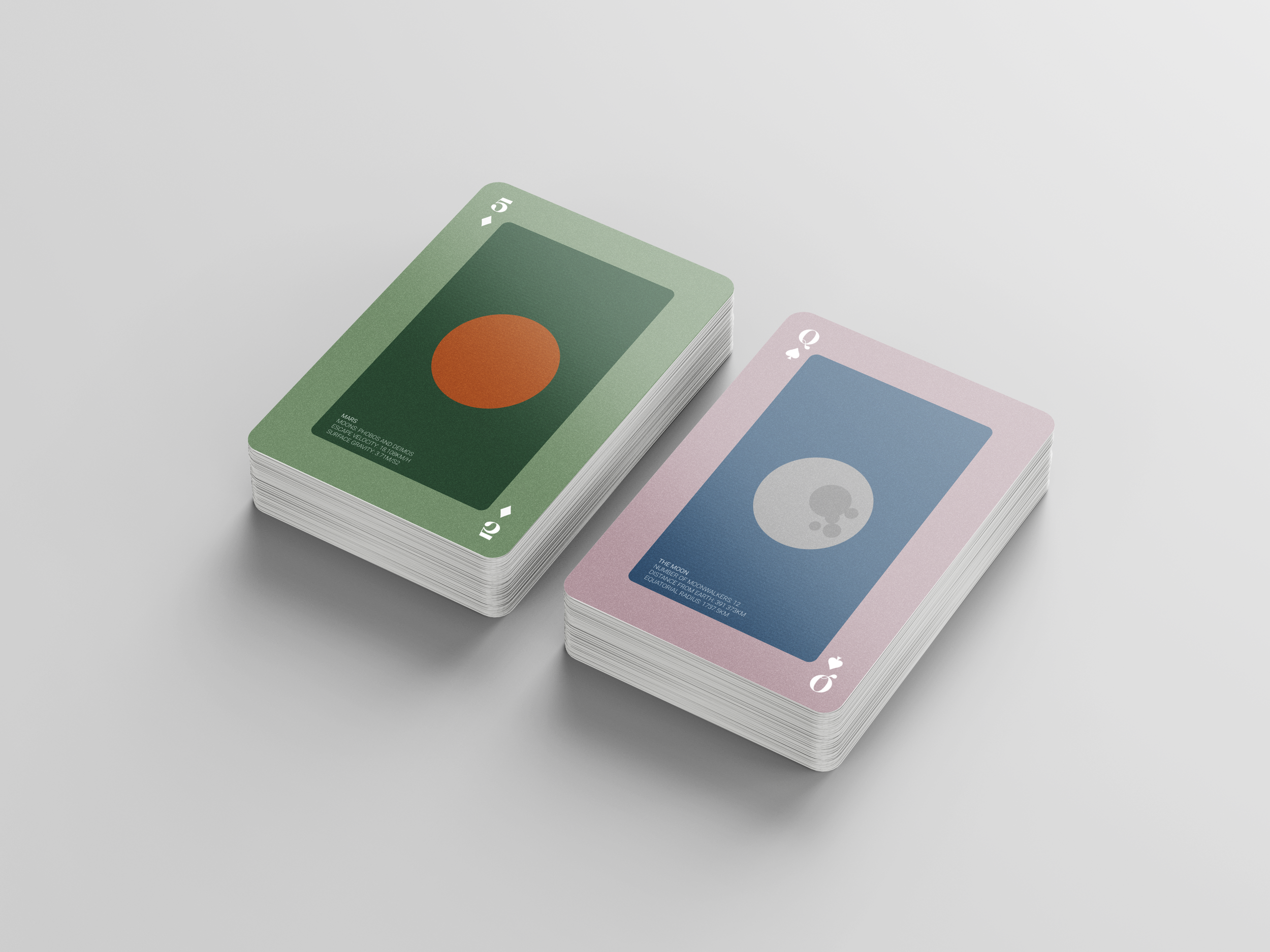
My favourite card is probably Jupiter with its tidal bulge, or Mars with its lush, close-to-nature-green background- a symbol for what humanity believes we can accomplish on this red planet.
For the future, I would love to expand this project and create a full deck, containing more planets and bodies such as other moons, specific asteroids and maybe even galaxies.